

Background
POET (or Photometric Observations of Extrasolar Transits) is a micro-satellite currently being studied and prepared for a projected launch in 2026. The satellite's goal is to detect planets orbiting stars outside of our solar system!
As a publicly funded project, POET needs a web footprint that serves two purposes: to inform the public about the project including mission goals, and to assist with scientific collaboration.
This project is my first time working on a team with stakeholders and a team of other people including the mission organizer, a dedicated content creator, and a grad student assisting with the web deployment. My partner is an academic astronomer who is assisting on this project and as they discussed the need for a website he suggested I hop in and help!
The Research
I want to note here that the type of information displayed on the site was largely outside of my control and so I was looking to how the information on a site is presented rather than what is presented in my research.
A look at the competition
My research for this project started looking at the sites created for other space satellite projects working towards similar research goals.
Of a handful that I looked at, they largely had a couple things in common: a ton of information and some incredibly questionable design. After talking about this with the stakeholders, they said that this largely comes down to the resources available on the projects. Most missions don't have a design budget at all, so it makes sense that "it works" is a sufficient metric of success.
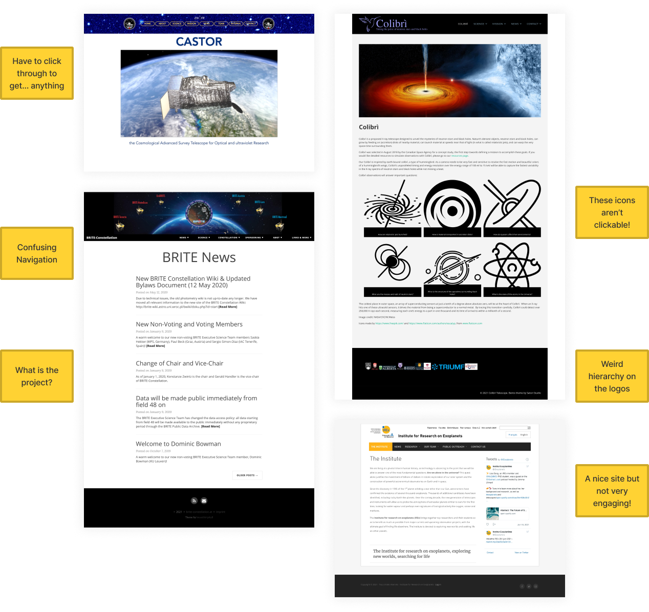
What many of these sites had in common are:
- Lack of Visual Heirarchy: I personally found this to be one of the most challenging things to get past when looking at the websites. You had to read the text to understand what was most important, rather than the design telling you what was important.
- A lot of information: These sites are jam-packed with information, making it difficult to read. Nobody likes a brick of text!
While discussing these sites with my design mentor, he made a great point:
What kind of websites do scientists look at? Any of them.
For the science-heavy folks, it doesn't matter what the site looks like, they'll comb through the information until they find it. But what about people who aren't scientists?
A look at heavy-information sites
To understand how non-scientists, or perhaps space enthusiasts, would like the site to look I took a big step back from space and science altogether. This subject is so niche, that limiting research subjects to those interested in science specifically really narrows the pool and may skew the data. In order to understand how people gather information and to pull some patterns from those places, a survey was conducted via Google Forms (you can review the questions and the results). My initial goal was to collect at least 10 responses and after receiving 15, I collated the results into an empathy map using Miro. (See the full board here)
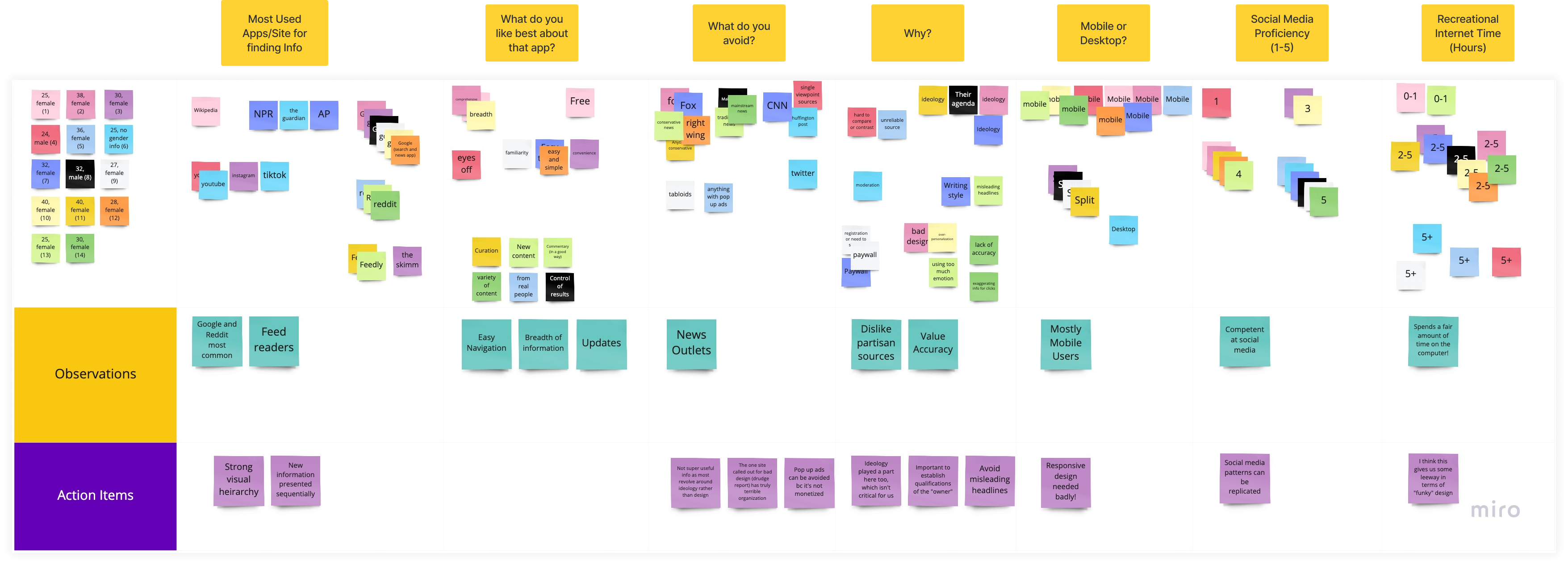
My main takeaways from this survey was:
- Visual Hierarchy is important! This observation was drawn from where people source their information, and a commonality between the most common responses (Google, Reddit, Feed Readers) is that they're all extremely skimmable.
- Responsive Design is required While this wasn't the stakeholders' original goal (responsive design is a rarity among the competition), this provided me the case to bring forward for its importance.
- Credentials need to be clear Trusting the source of information was valuable to most participants, and so we need to make clear that what is displayed is trustworthy and accurate.
Working with Stakeholders
The team that I worked with through this process was primarily four people:

We had weekly standups to discuss the progress of the site, review designs, and discuss content. This project was not the primary task for anyone on the team (except me!), so getting everyone together and on the same page regularly was critical for progress. Outside those meetings, I worked primarily with Sonya who had been working on creating the content for the site. We had to go back and forth quite a bit to trim the content, and work on accommodating each other's needs: for me, making sure the content aligned with our goals. For her, making sure the content was comprehensive and accurate.
I learned a lot working with a team as a UX designer for the first time! There was a lot of trial and error in terms of collaboration (for example, asking the uninitiated to work in Figma is, possibly, a bad idea) but by the end I think we did well working in short (~30 minute) zoom calls to just talk through pain points rather than waiting hours/a day for emails/slack messages.
The original plan had Dereck implementing the website, however our vision overtook his ability to do so (both in terms of coding but also time). I then took the reins and built the site in Webflow, since we were able to export and upload the design from there onto the university server.
The Concept
After meetings with stakeholders we arrived at the broad goal to create a responsive website that goes beyond what other projects have done - our goal was to create a site that appealed to and worked for both scientists and enthusiasts.
Information Architecture
After deciding on the information architecture for the site, we settled on an MVP to be completed by our deadline. This included the sections under "The Science" and "The Satellite" - the rest can be filled in later on.
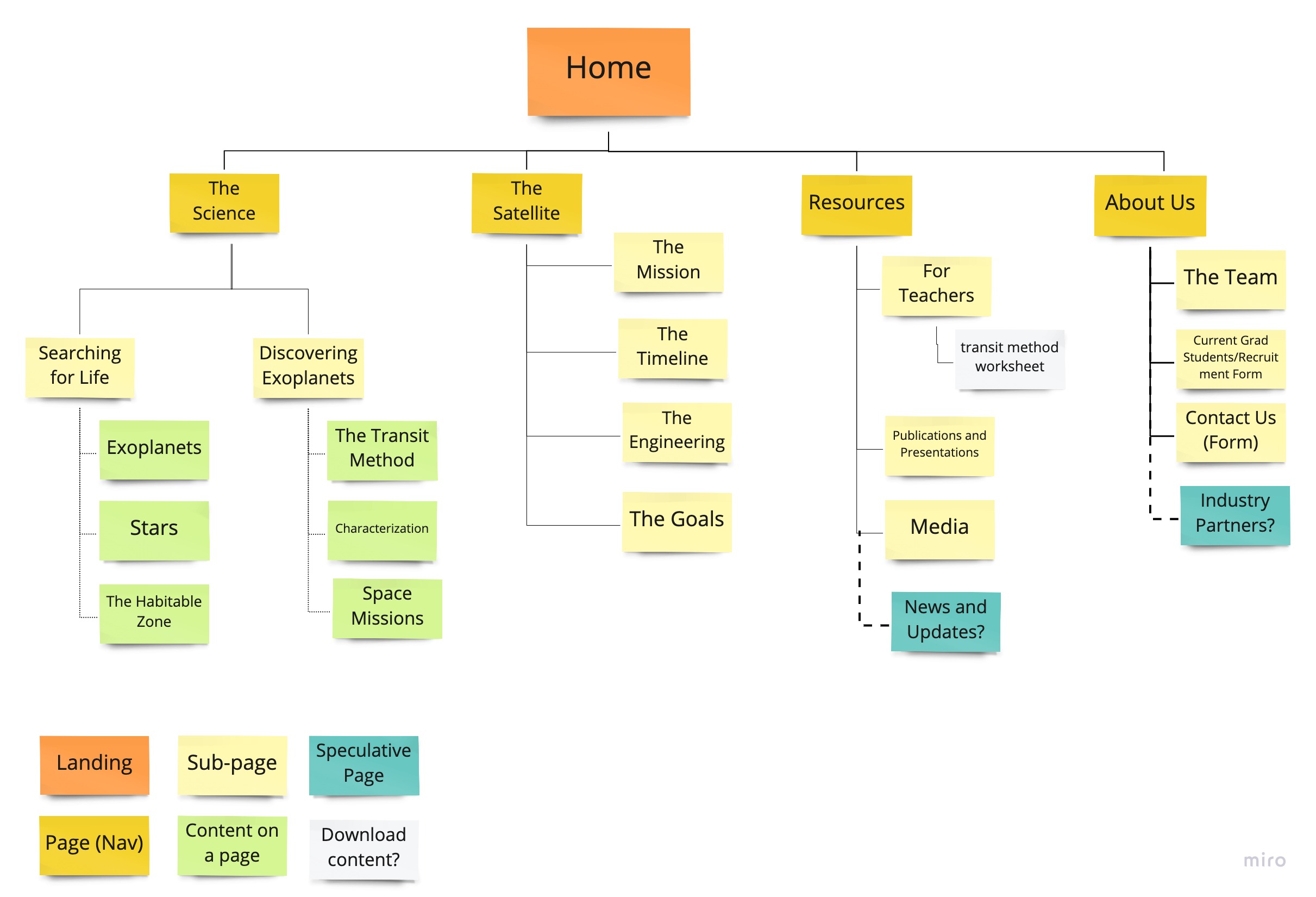
This allowed us to prioritize which sites to focus on and which ones could enjoy "placeholder" status for launch. While some changes to the navigation did change before launch (eg. changing 'The Science' to 'Mission Goals' and combining some of the content we had on separate pages into single pages), this framework guided us for the majority of the process.
The Design
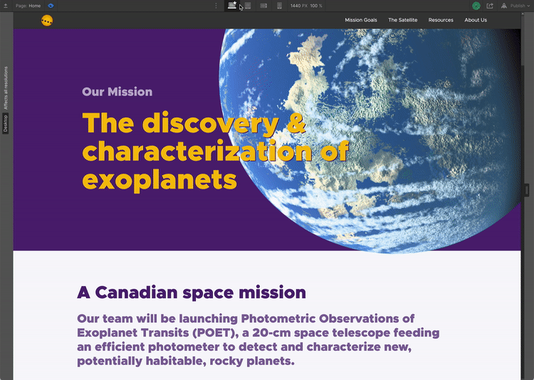
The design was launched in May 2021, and we met our goals for MVP. The website is viewable here!


Responsive Design
It was clear from my research that this site needed to be mobile-responsive. This was definitely a challenge in terms of implementation - we have lots of content and building the site to accommodate all of this at different breakpoints took a lot of trial and error.
Credentials & Trustworthiness
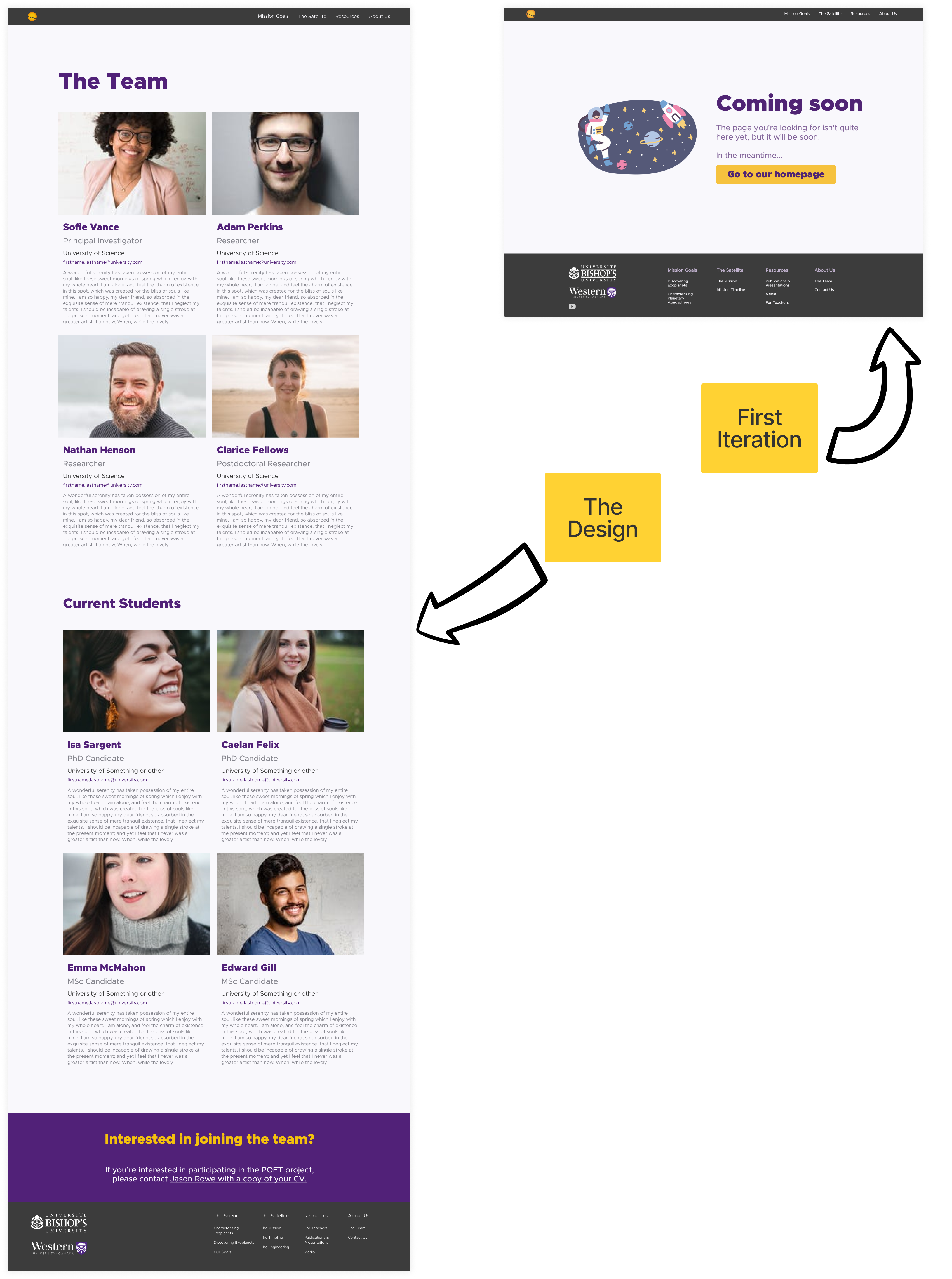
One of the key items that came up in my research was establishing trustworthiness and credentials. One way to do this is with an 'about us' page that goes beyond just names and email addresses - while we weren't quite able to pull this off for the launch (turns out getting current photos and biographical information from already-busy researchers is not easy), I built the design to rely on a component system so implementation will be easy and quick!
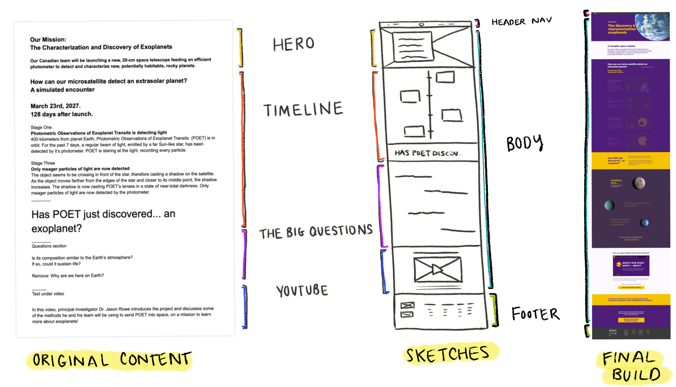
Designing to Content
One of my biggest challenges with this project was designing around the content provided to me. After I had spent a handful of time sketching and creating wireframes for how I envisioned the site, the more appropriate approach turned out to be to look at the text provided to me, and then break that down into sections that I could then design individually. The example below shows roughly how I wound up approaching the home page - from text, to sections, to the final result.
The UI
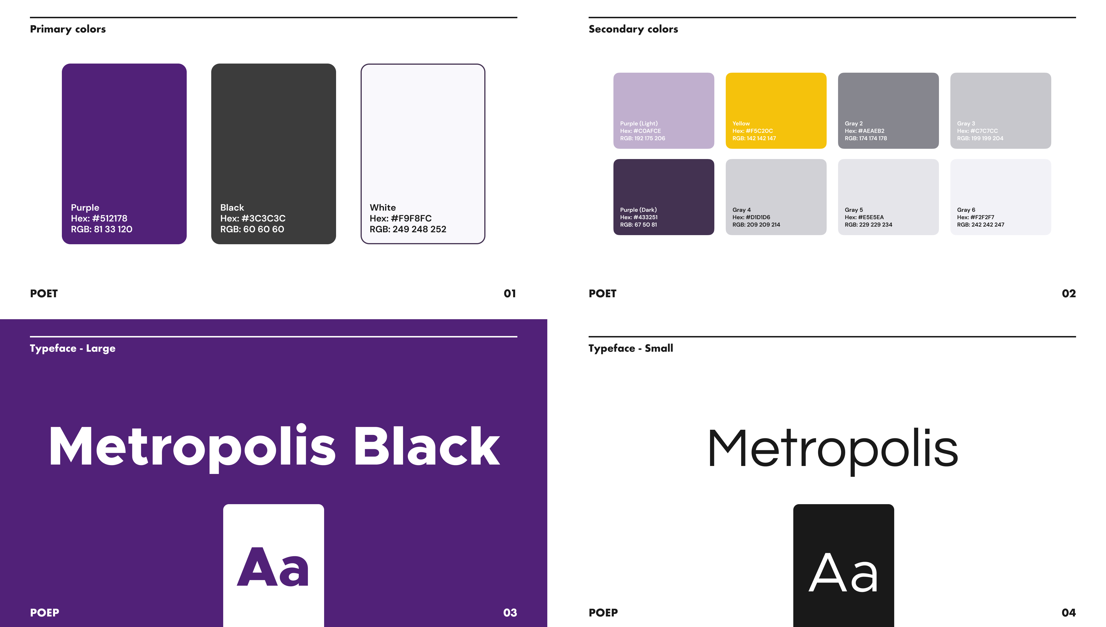
When I approached the UI for this site, I wanted to go with something a bit bold (it is, after all, a bold project) and I went with this royal purple as our primary colour for a few reasons. Of those, the most important was that it matches the existing school colours for both principal universities on the project.
For the logo, the stakeholders wanted something simple that incorporated aspects of the actual science. In this case, the satellite is looking for planets crossing in front of stars, so we wanted to make that clear. After doing paper sketches, I vectorized a few of my favourites and after some refining with the team we landed on our final choice.
Initial Positive Feedback
After the site launched, there was a flurry of media attention on the project surrounding some funding announcements. At the kickoff meeting with the Canadian Space Agency (CSA) , the project director sent the team some initial good feedback.
This made me so happy! That the design is going over well with smart folks who run a space agency.. what a treat!
Next Steps
As this satellite won't launch for a few years yet, this will be an ongoing project that I hope to continue to be involved with. In the short term, there are a few key steps that we're looking at taking:
Improving the Visual Design
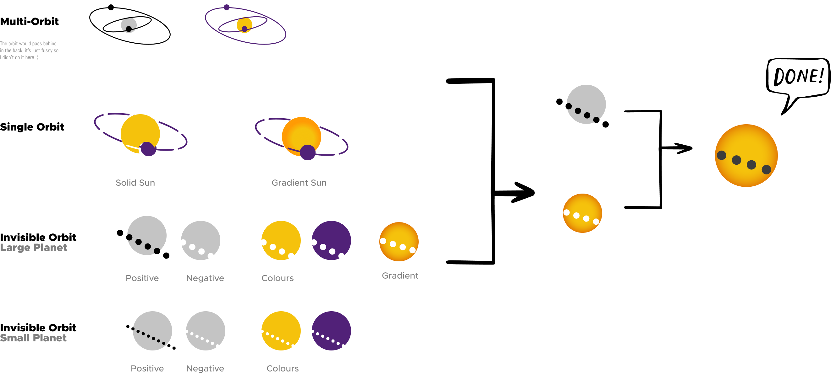
One of the tradeoffs I made in this project was focusing my energy on the build as opposed to refining the design. There are some places I would like to keep working with. One example of this are the "planet balls" on our information pages. I wasn't able to get them to work in the responsive design at launch, but I think getting them in would be great because it creates cohesion with the landing page and makes it overall a bit more I interesting.

Adding More Pages
Our IA still isn't fully completed so a primary task will be continuing to work with the team to build those out. As the project approaches launch, more information will become available to do so!
Enhancing Brand Clarity
Some feedback we received is that the name of the project isn't sufficiently clear, and they're right! The name of the project (POET) doesn't appear until nearly the fold (on web) so we need to look at including it in the nav, at minimum.
Summary
While this design is, admittedly, nowhere near perfect, I consider it a bit of a personal triumph. At the beginning of this project, I had only completed one theoretical design and now something I helped make lives on a University website.
As I go forward as a designer, there are a seemingly-endless number of things I'll take away from this project but these are the most important:
- Understanding basic css (or even roughly how it works) makes my designs better. Building my site in Webflow, even though it's not "coding" really gave me insights into the limitations of some of my designs. Further, being able to speak the language of developers will be an asset for future collaborations.
- Collaboration requires persistence, and a little bit of letting go. There's a fine line between advocating between your design and being overbearing. Knowing when to capitulate and when to be firm is tough, and I really had to evaluate which battles I wanted to pick. This was hard (I still think there's too much content) but I'm not the project owner, and that's OK!
- Planning a small-scale design system is so helpful: This takeaway relates specifically to building out the responsive cases. When I initially built my pages in Figma and then Webflow, I focused only on a desktop-sized breakpoint, planning to simply scale down as I went. I learned the hard (& time consuming) way that planning these breakpoints in parallel is the way to go.
- Knowing your limits. This one has always been a struggle for me - I can sometimes bit off more than I can chew, and in this case it was definitely building in Webflow. It was a super steep learning curve that took a lot of time away from other learning I could have been doing. If I were to do it over again, I might look at a more template-based solution rather than working fully from scratch!